Wednesday, December 21, 2011

My R.I.L.S. - Creating an Online Portfolio for Art & Design Students

RILS Plan: Creating Online Portfolios for Art Students & Designers


Brief Overview:  Students looking to enter the creative arts industry need an online portfolio. Creating one from scratch can be time-consuming, costly, and unpredictable. This scenario will show students how to create an online portfolio using Carbonmade.com and give each other feedback on an Edmodo.com class site.

Target Audience
Post secondary students studying fine arts or graphic design.

Materials:
o   Computer with Internet access
o   Hard drive access to samples of best work
o   A free Carbonmade.com account
o   (Instructor) – A free instructor’s account on Edmodo.com
o   (Student) – An Edmodo.com Group Code provided by instructor
o   Digital camera (optional)
o   Scanner (optional)

Objectives
Students will:
o   Remember key points of online portfolio expectations
o   Understand the pros and cons of an online versus a print portfolio
o   Establish their online account with Carbonmade.com.
o   Analyze and categorize artwork based on media type or industry type.
o   Evaluate and critique the portfolios of other classmates via the online group created on Edmodo.com.
o   Present their creative portfolio site to faculty, colleagues, or internship department.

Procedure
o   Instructors:
·       Familiarize yourself with Carbonmade.com. (Free vs. Premium features, file types, file size limitations)
·       Create a Teacher’s account on Edmodo.com. Set up your profile and create a group for your portfolio students.
·       Obtain an ‘invitation only’ code to distribute to your portfolio students so they can access the Edmodo.com site.
·       If necessary, have the digital camera and scanners ready in case students need to digitize any work.
o   Students:
·       Create a folder on your computer with samples of your best work. If necessary, use the digital camera or scanner to capture your files.
·       Create a free account on Carbonmade.com
·       Export and upload portfolio files to Carbonmade.com & organize them by category.
·       Obtain the ‘invitation only’ code from your instructor to join the portfolio class group created on Edmodo.com
·       Set up your profile to include a link to your Carbonmade.com portfolio
·       On the Edmodo.com “Post” wall, leave a link to your Carbonmade.com portfolio. View other student’s portfolios and leave constructive feedback on the discussion board.


Emerging Technology
·       Carbonmade.com – A free portfolio tool for creatives - http://www.carbonmade.com
·       Edmodo.com – A free Learning Management System that allows teachers and students to connect over school content – http://www.edmodo.com

Social Participation/Social Learning
·       By using the invitation code to access the class section online, students will have a closed, secure place to give each other comments and feedback on their Carbonmade portfolio site. Students can also post links to sites on portfolios, internships and industry news.

Making Connections
Students will connect:
·       Student-to-Teacher: As facilitator & supporter, the teacher will promote engagement, offer technical support & guidance
·       Student-to-Student: Students will collaborate with each other
·       Student-to-Targeted Global Audience: Students will connect with strategic avenues to make sure their portfolios are seen by the desired audience

Create/Produce
·       The end product will be a student portfolio representing samples of their best, marketable work.
·       It’s important to note that the pieces in the portfolio were chosen based on a collaborative process by fellow students, and not by the individual student alone.


  • Reflection  
    • Student Reflection: Students will reflect on the experience of creating a portfolio and collaborating in an online environment by posting to the class group on Edmodo.com
    • Teacher Reflection:  Teachers will reflect via a brief feedback form submitted online through Google Docs. 


Read More

BP8 - RILS Review

Review #1: Getting To Know You


This RILS project uses Tagxedo to create an 'ice breaker'.
Click here to read my review...

-----

Review #2: Using GarageBand to create Photo Podcasts


As someone who is very, very interested in creating Podcasts, this RILS project really caught my attention. Read my comments...
Read More

Saturday, December 10, 2011

PE5 - Glogster Community

In this post, I am continuing my review of Glogster, a social networking site that allows you to create interactive posters with text, image, audio and video. The previous post centered around creating a Glog (graphical blog). Now I'd like to explore the social networking aspect of the site.


Once you are a member of Glogster, you are part of a community. Glogsters can enjoy benefits such as earning "G's", commenting on other Glogs, and much more.


Earning "G's"
I have 32 G's so far!


Who doesn't like incentives? "G's" are Glogster status points. Simply put, the more Gs you have, the more respected you are among the Glogster community. You can earn points for little things (signing up, logging in each day, creating a Glog) and for big things (registering a mobile device with Glogster, referring a friend, or becoming a Mover & Shaker.) Currently, you can't redeem your G points for cash or anything else. They're just for status and bragging rights.


Movers & Shakers
If you create a Glog that is noteworthy and gets a lot of buzz, one of the Glogster admins may elevate you to the rank of 'Movers & Shakers'. For example, this one on a TED Conference Photosynthesis Demo was chosen as a Mover & Shaker:


A Glog on a TED Conference


Explore
The Explore section of Glogster lets you keyword search for Glogs and view others based on categories (Fashion, Education, Art, Family, etc.) When you view another person's Glog, you can leave a comment, 'like' it, share it on Facebook, Twitter or Google +. You can even embed the Glog in another website 

Read More

PE4 - Glogster

The focus of my RILS project centered around finding online portfolio solutions for my 4th semester design students preparing to graduate. In an earlier post, I reviewed my experience with Carbonmade.com, a free portfolio site specifically for designers and artist.
But what about my 1st semester students? Shouldn't they get a feel for uploading samples of their work? Granted, first semester students probably won't have portfolio-ready work, but they will have projects and assignments from some of their courses.

Enter Glogster.com

According to Wiki, "Glogster is a social network that allows users to create free interactive posters, or glogs. A glog, short for graphical blog, is an interactive multimedia image. It looks like a poster, but readers can interact with the content."

I decided to give Glogster a try and see if it would be a FUN, easy-to-use option for my students.

Once I created my free account, I was taken to my Glogster Dashboard where I could create my profile, manage my 'glogs', and interact with others.
To begin a new Glog, I had to choose between portrait or landscape orientation.


Layout/Media Options:
Glogster gives you a ton of preset design components to start with. The component categories are: Text, Graphics, Image, Wall, Audio, and Video.

Text - Adding text is as easy as clicking "Use It" from the Text section. Once you add your type to your Glog, you can choose from a number of fonts, change the color, size, and alignment. Downside? You don't have a lot of fonts to choose from and you're not able to control kerning & leading. For a typographic nutcase like me, this is a major issue. I also noticed that Glogster would change my fonts upon saving and reopening.

Graphics - This section allows you to add clip art to your design. They have a nice categorized section and some of the graphics are even animated. One on your page, you can resize and rotate the graphics. You can also make them hyperlinks and add drop shadows. Downside? I wish they would allow you to change the color of the graphics. I also noticed they don't have basic solid shapes (squares, circles, and such. You may have to upload them yourself.)

Image - Glogster allows you to upload images to your layout. A nice feature is the ability to also search for images across your Facebook, Flickr, and Picassa accounts by signing in. There is also a Google search built in for images. Downside? None.

WallThis section is where you can customize the background of your Glog. You can go as subtle as a solid color or choose from a selection of themed and abstract backgrounds.

Audio - You can upload audio in a number of popular formats. You can even choose from a variety of playback players to control the music on your page.

Video - Really make your Glog entertaining by adding video from your computer. It can also add video from YouTube or Vimeo. Once you choose a video, it can be customized with a video player to match the style of your layout. Downside? Searching for a video from YouTube was very glitchy. When searching with keywords, the screen would just freeze. I eventually had success when I realized you could also add video by providing the web URL.

Grab - Some of the content categories had a 'grab' feature which connected to my Mac's built-in camera. I could capture a photo or video and add it directly to my Glog.

Social/Sharing - Once your Glog is done, you're able to share it with the world with a link or directly to Facebook & Twitter. Glogster also has a built-in community where you can add friends and comment on each other's work. Glogs can also be tagged for easy searching.

Overall:
Glogster has established quite a following. They've even expanded into the education industry with the addition of Glogster EDU for educators. Glogster's support is comprehensive. There is a FAQ as well as a user-run community support forum for help and issues. My one big caveat with Glogster is really an unbelievable omission on their part: NO UNDO. That's correct. If you make a change in your layout, and you want to undo the change, you can't. That is almost a deal breaker for me. Other than that, Glogster is a great way for students to create interactive posters!

Here's my creation on Glogster.


Read More

Sunday, December 4, 2011

BP6 - Karen's Yacapaca

Yacapaca. It's just one of those words that's makes you giggle when you say it. My colleague Karen Smith reviewed this site and I definitely know I'll be trying it out soon. Check out Karen's review of Yacapaca on her blog.
Karen's review of Yacapaca.

Read More

BP5 - Love Marching Bands? Check Out Anthony's Blog

I really enjoyed reading the blog of my colleague Anthony Hunt. Little does Anthony know that I was a band geek in high school! So I can relate to his passion for marching bands. Check it out at Ant Hunt's World.
Anthony Hunt's Blog

Read More

BP4 - Carbonmade


One of the graduation requirements for our Digital Media Arts students is to have a portfolio that showcases samples of their best work. Currently, they take a 4th semester portfolio class where they assemble a professional print portfolio that they can take on interviews. Students are encouraged to have a website, but they often lack the funds and technical knowledge to create a 'dot-com' portfolio site. So, in searching for a solution to this problem, I came across Carbonmade.
Carbonmade's  artistic homepage.
Carbonmade allows users to create a clean, professional online portfolio without the hassle of writing code. Because Carbonmade specifically caters to designers and artists, I felt it would be a great solution for my students. So I decided to give it a try.
Creating a sub-domain address
Signing up for Carbonmade is free and easy. Once you create a unique sub-domain (somename.carbonmade.com), username and password, you can begin setting up your Projects. Think of Projects as separate categories of your work. Carbonmade's free account allows you to have up to 5 Projects, and each Project can contain up to 7 images. For example, a student can create Illustration, Photography, Branding, Web Design and Package Design Projects. I created a Project showcasing some Custom Chocolate Bars that I designed a while back. Users can include an “About Me” section with contact information and a link to their PDF resume. Upgrading to a premium account gets you 50 projects, 500 images, and 10 videos.
You can customize your profile that reflects your interest and skills

You a few custom settings with a free account
Organizing the images and adding captions
I really like Carbonmade as a professional portfolio option for design students. Their quality of service and ease of use will certainly earn a thumbs up of approval from my students. Here is a link to my sample Carbonmade portfolio of Chocolate Bar Wrappers.
Read More

Saturday, December 3, 2011

PE3_iMovie

There's a First Time for Everything.

In all, it took me about an hour and a half to think, shoot, organize, edit and export my 1 minute video. The bulk of that time was spent editing the clips.  Exporting the finished project was a very easy procedure. iMovie tries to remove a lot of guesswork from the process. It presents the most likely options where you want your movie to be viewed and handles the rendering from there.
What other 'share' options do you need?

iMovie quickly rendering the video file

I remember taking a digital video course in college back in nineteen-ninety-oh-god. We'd have to let the computer render our short video files for hours on end. Now, computers today are able to render videos quickly with excellent quality. iMovie rendered quickly and gave me a file that was YouTube friendly. Within a matter of minutes, my finished video was on the web.
Video uploaded to YouTube

After using iMovie to create a Movie Trailer featuring my 9 year old, I was left with a sense of accomplishment because I really did try something new. I think the Movie Trailers are a great way for students and novices to put together a fun, creative short video without the technical distraction of the other major movie editors (Adobe Premiere, Adobe After Effects).

In regards to the iMovie Essentials Training video, I think it is a comprehensive, easy-to-follow training module to get anyone started in the basics of iMovie. Garrick Chow sets up the videos in short, bite-sized segments so you can focus on certain features. I'm always interested in going beyond the basics. However, I think for iMovie, that would mean using other video editors along with iMovie to do more complicated effects. Finally, at the end of the video training, I was given a Certificate of Completion!


My Movie Trailer Video:


Read More

PE2_iMovie


The Hills & Valleys of Creating an iMovie Video


Getting the Kodak Flip Video ready to shoot
In my previous post, I shared my initial experience with the iMovie Essential Training Video series on Lynda.com. My interest level was not peaked until I started watching Chapter 5 on editing. The still frame technique gave me an idea to create a short action video utilizing that technique. With my Kodak Flip Video camera in hand and my energy-ridden 9 year old at my disposal, I had the perfect opportunity to capture an action shot.


Putting it Together
Importing video from the Kodak is a breeze!


Using the Trailer Video builder in iMovie
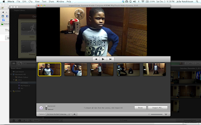
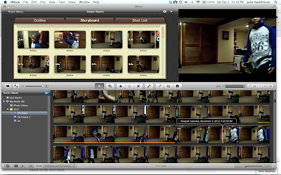
Once I had video of my son, it was very easy for me to transfer the video from the Kodak Flip and into iMovie. (I do wish the 'drag and drop' feature could be used with video.) I also decided to experiment with the Movie Trailers option. This was another feature I had never used before. I liked the automation of the trailer-building process. All I had to do was modify the script and select clips based on the shot sheet. It's also nice to know that iMovie organizes your clips and project files. No need to worry about saving.


What I didn't like is the lack of fined tuned controls. By using the Movie Trailer template, I was not able to edit the duration or orientation of my clips. I also could not extract a frame from the clips. It would be nice to have those controls with the Movie Trailer template for those who want more customization and fine tuning of the clips. Those features are only available in the regular template projects.

In my next blog post, I'll wrap up my review of my iMovie Essential Training experience and show you a sample movie.

Read More

PE1_iMovie

I'll be the first to admit, I was not looking forward to watching a 3 1/2 hour training video for a software that I already use in my classes. I didn't think there was anything else relative to learn in iMovie. Boy, was I wrong. (That's the downside of being self-taught).

"Nothing to See Here, Folks!"
Eager to earn my Certificate of Completion, I hunkered down and started watching the first batch of videos. For me, the first 30 to 45 minutes of the Essential Training was to review things I already knew and to confirm whether or not I had been teaching the proper methods. There were a few alternative methods for importing video that I never considered (importing from a SD or CF card, for example.) Otherwise, I was in familiar territory.
iMovie: Setting Up the Interface. So far, so good.


"You Can Do WHAT?!?"
I finally got around to Chapter 6: Working With Effects when Garrick Chow showed a technique I'd never tried in iMovie. It was the still frame footage technique where you can extract a single frame from a video sequence and edit it independently. When I saw that, about a dozen idea light bulbs went off in my head. I suddenly had an idea for my Sample Project Video.
Can you imagine the possibilities with that technique?!


Read More

© The Digital Clouds, AllRightsReserved.

Designed by ScreenWritersArena